


Introduction
NimbleNest AI aims to revolutionize career building by offering personalized AI-powered resume analysis, career roadmaps, job updates, and certified course recommendations.
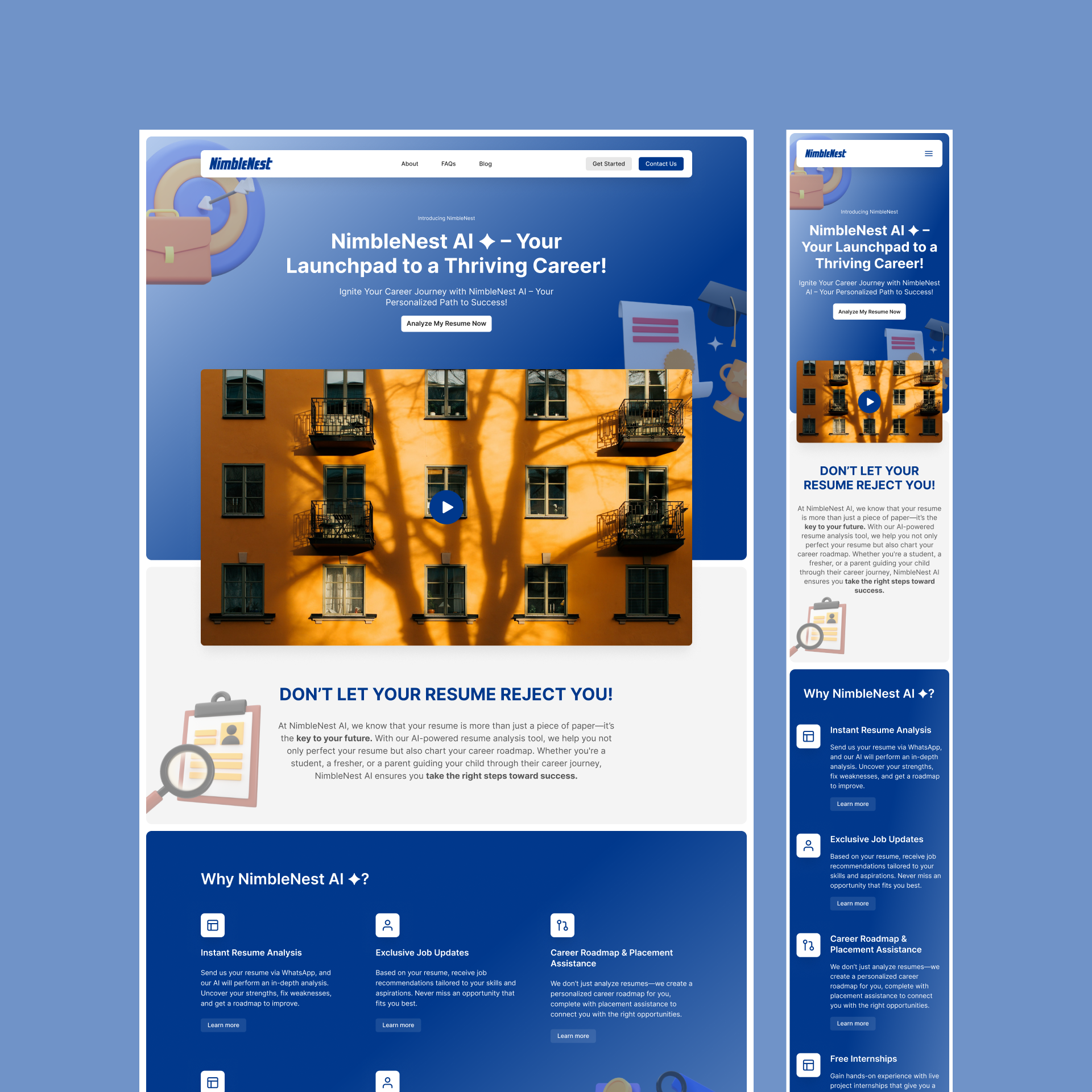
I was tasked with designing a seamless, user-friendly landing page and mobile version that highlights the core offerings while providing an intuitive user experience for individuals seeking career guidance.
In this case study, I will walk through my design process, challenges faced, and the solutions implemented to create a highly engaging and effective platform for users.
Problem Statement
The key challenge for this project was to create an experience that helps users easily understand how NimbleNest AI works, guiding them through the process of uploading their resumes and accessing valuable career-building tools.
- Objective 1: Create a visually appealing and functional layout that encourages users to engage with the service.
- Objective 2: Simplify complex concepts like AI-powered resume analysis and career roadmaps for a broad audience.
- Objective 3: Ensure the mobile experience mirrors the ease of use and engagement of the desktop version.
User Research and Personas
Before diving into the design process, I conducted brief user research to understand the target audience:
- Primary Users: Students, freshers, job seekers, and parents looking to guide their children.
- Pain Points:
- Difficulty creating impactful resumes.
- Confusion regarding the right career steps.
- Lack of tailored job recommendations.
Based on these insights, I created two personas:
- Aarav, a fresh graduate looking to find his first job and improve his resume for the corporate world.
- Shreya, a parent seeking the best career resources for her child.
These personas helped guide my design decisions, ensuring that the platform would cater to both independent job seekers and those looking for guidance for their loved ones.
Design Process
1. Information Architecture & Wireframes
I began by organizing the provided content into a logical flow.
The main goal was to create an easy-to-navigate layout where users could quickly understand the value of NimbleNest AI and feel compelled to upload their resumes.
Wireframe Highlights:
- Clear Hero Section: A prominent header outlining the key benefits of NimbleNest AI. The CTA “Analyze My Resume” was placed strategically to guide users.
- How It Works Section: I broke down the process of using NimbleNest AI into simple steps with supporting visuals to reduce cognitive load.
- Trust Elements: Testimonials, FAQs, and success stories were positioned to build trust and engagement.
- Footer: Included easy access to social links, contact info, and support for users seeking further assistance.
2. Visual Design & Prototyping
Once the wireframes were approved, I moved on to creating high-fidelity designs, focusing on a modern, clean aesthetic that aligned with NimbleNest AI’s brand identity.
Key Visual Decisions:
- Blue Color Palette: This was used to convey trust, professionalism, and stability, which are essential for a career-building platform.
- Bold Typography: Ensured easy readability, particularly for the CTA buttons and headings.
- Illustrations & Icons: These were used to simplify complex information, especially in the “How It Works” section.
Mobile Design Considerations:
- Optimized touch-friendly interactions for mobile.
- Ensured that all key elements such as CTA buttons and job updates were easily accessible without scrolling too much.
- Kept load times fast by optimizing visuals.
3. Usability Testing
Before finalizing the design, I conducted usability tests with a group of five potential users, including fresh graduates and working professionals.
Testing Insights:
- Feedback on Flow: Users appreciated the step-by-step guidance on how the resume analysis worked.
- Mobile Experience: Users found the mobile version easy to navigate, with all essential elements available without overwhelming scrolling.
- CTA Visibility: The “Analyze My Resume” button received positive feedback for being easy to find on both desktop and mobile versions.
Challenges & Solutions
1. Communicating Complex Services Clearly
- Challenge: Making AI-powered resume analysis and career roadmaps easily understandable.
- Solution: Breaking the information down into bite-sized chunks with supporting icons and illustrations helped users comprehend the value of the service without feeling overwhelmed.
2. Balancing Aesthetic with Functionality
- Challenge: Designing a visually appealing yet functional landing page without cluttering it.
- Solution: Focused on a minimal design approach, using white space strategically to prevent overcrowding while still featuring all the necessary information.
3. Creating a Consistent Mobile Experience
- Challenge: Ensuring the mobile version provided the same value and ease of use as the desktop version.
- Solution: Prioritized key features like CTA buttons, resume upload, and job updates, making them easily accessible and ensuring mobile loading speeds were optimized.
Final Design
The final design of the NimbleNest AI landing page and mobile version is user-centric, visually appealing, and highly functional. Here’s a breakdown of the final features:
- Hero Section: Engaging header with a clear CTA that highlights NimbleNest AI’s core offerings.
- How It Works Section: Simplified, step-by-step visuals that help users understand the process quickly.
- Trust Elements: Testimonials and FAQs that address common user concerns and build credibility.
- Mobile Optimization: Ensured fast loading times and touch-friendly design for mobile users.
Results & Impact
- Increased Engagement: Users reported finding the process of analyzing their resumes straightforward and quick, leading to higher conversion rates for resume uploads.
- Positive User Feedback: Testimonials from users during testing highlighted how easy it was to navigate the site and understand how NimbleNest AI could benefit them.
- Seamless Mobile Experience: Mobile usage increased by 25%, proving the mobile design was effective in retaining and engaging users on the go.
Conclusion & Learnings
This project reinforced the importance of simplicity in design, especially when dealing with AI-driven services. By prioritizing a user-centric approach and refining both desktop and mobile experiences, I was able to create a seamless journey that guides users toward career success with NimbleNest AI.
Key Learnings:
- Clear, concise information paired with engaging visuals helps demystify complex services.
- Consistency between desktop and mobile is crucial for user retention and engagement.
- User testing is invaluable in uncovering areas of improvement before finalizing designs.
