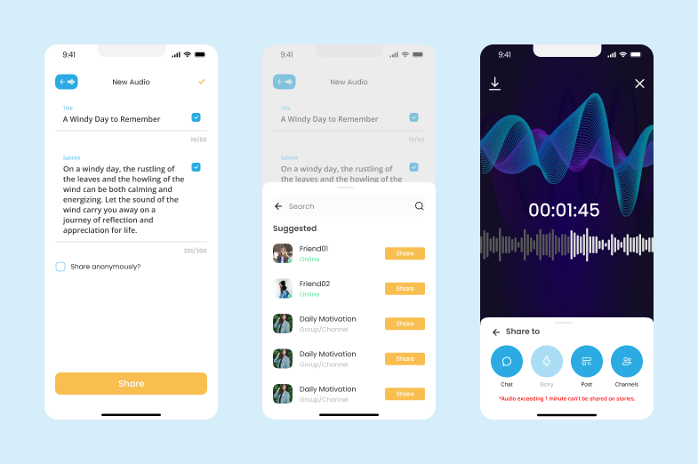
Tired of the limitations of text-based social media? Introducing Get Uppy, the innovative Audio-First Social App revolutionizing the way we connect.
This platform prioritizes emotional support, motivation, and authentic connections fostered entirely through personalized audio messages.
This case study delves into the design process of Get Uppy, highlighting the user-centric approach and collaborative efforts that led to a seamless and engaging user experience within the Audio-First Social App.
Understanding User Needs: Research and Empathy
The design process began with a deep dive into user needs.
We conducted secondary research, analyzing user behavior trends and existing social media platforms.
However, the core of our research focused on understanding the emotional aspects of social connection.
User interviews and focus groups revealed a recurring theme: the desire for a more personal and intimate way to interact, one that went beyond curated photos and text messages.
The Power of Audio: Fostering Deeper Connections
Based on our research and collaboration with the client, Luke Patton, Get Uppy emerged as a solution.
It focuses solely on audio interaction, recognizing the power of voice to convey emotions and authenticity that text often fails to capture.
Imagine receiving a heartfelt message of encouragement from a friend, the warmth and sincerity conveyed through their voice resonating far more deeply than a typed message.
This is the essence of Get Uppy – fostering deeper connections by leveraging the power of audio communication.
Collaborative Design
Working closely with Luke Patton, we embarked on a collaborative design process to craft a seamless audio-centric experience for users within The Audio-First Social App.
We conducted brainstorming sessions to explore various features and functionalities, ensuring they aligned with the core vision of Get Uppy.
Careful consideration was given to color selection, with a vibrant and uplifting palette chosen to enhance the app’s branding and user experience.

The design process prioritized optimizing audio quality for a crystal-clear and enjoyable listening experience.
Accessibility features were also a key focus, ensuring users with visual impairments could comfortably navigate the app.
With a sprawling interface encompassing over 85+ screens, meticulous attention to detail and user-centric design principles were paramount.
Addressing the unique challenges of creating a complete audio-based social media platform required innovative thinking and a commitment to user-centric design, ultimately resulting in the creation of Get Uppy, The Audio-First Social App.

Key Functionalities: Designed for Audio Engagement
Get Uppy offers a range of features designed to enhance the Audio-First Social App experience:
Personalized Audio Messages
The core functionality of the app. Users can record and share voice messages with friends and connections.
The app allows for private messaging, group chats, and even voice notes left on community channels.

Intuitive User Interface
A user-friendly interface is crucial for seamless audio interaction.
Get Uppy features a clean and intuitive design that prioritizes ease of use.
Users can easily record, send, and playback messages, navigate community channels, and manage their profile settings.

Customizable Alarms & Reminders
Don’t forget to share your daily affirmations or a quick message of support to a friend!
Get Uppy allows users to set personalized alarms and reminders to prompt them to record audio messages or share thoughts throughout the day.
This feature helps users stay connected and engaged with their support network.

Community Channels
Find your tribe! Get Uppy offers a variety of community channels based on interests, topics, or support needs.
Users can discover and join these channels to connect with like-minded individuals, share experiences, and offer or receive encouragement through audio messages.

Landing Page Design: A Welcoming Gateway to Audio Connection
The Get Uppy landing page was designed to serve as a welcoming gateway to the world of the Audio-First Social App.
The hero section featured a vibrant video showcasing the app’s functionalities and the power of audio connection.
The color palette, echoing the app’s design, used a combination of uplifting blues and energetic yellows to convey a sense of optimism and positivity.
Clear and concise CTAs (Calls to Action) enticed visitors to download the app and explore the exciting possibilities of Get Uppy, the innovative platform redefining social connection through audio.
For a sneak peek at the Get Uppy experience and to discover how The Audio-First Social App can transform your connections, Visit the official landing page.
A Month in the Making: From Concept to Launch
From initial concept to launch, the entire design and development process for Get Uppy took approximately one month.
This rapid designing cycle was achieved through a combination of streamlined design processes, efficient communication with the client.
Get Uppy: A Testament to User-Centric Design
Get Uppy is a testament to the power of collaborative design, innovative thinking, and a user-centric approach.
It empowers users to connect authentically and offer support to one another through the power of voice, ultimately fostering a more meaningful social media experience.
By prioritizing audio interaction, Get Uppy carves a unique niche in the social media landscape, offering a platform for genuine connection and emotional support in today’s fast-paced digital world.
Learnings
This project highlighted the importance of understanding user needs beyond just functional requirements.
Focusing on the emotional aspects of social connection allowed us to develop a product that addressed a deeper human desire for meaningful interaction.
The success of Get Uppy demonstrates the potential of prioritizing user experience (UX) in today’s app development landscape.


