Introduction
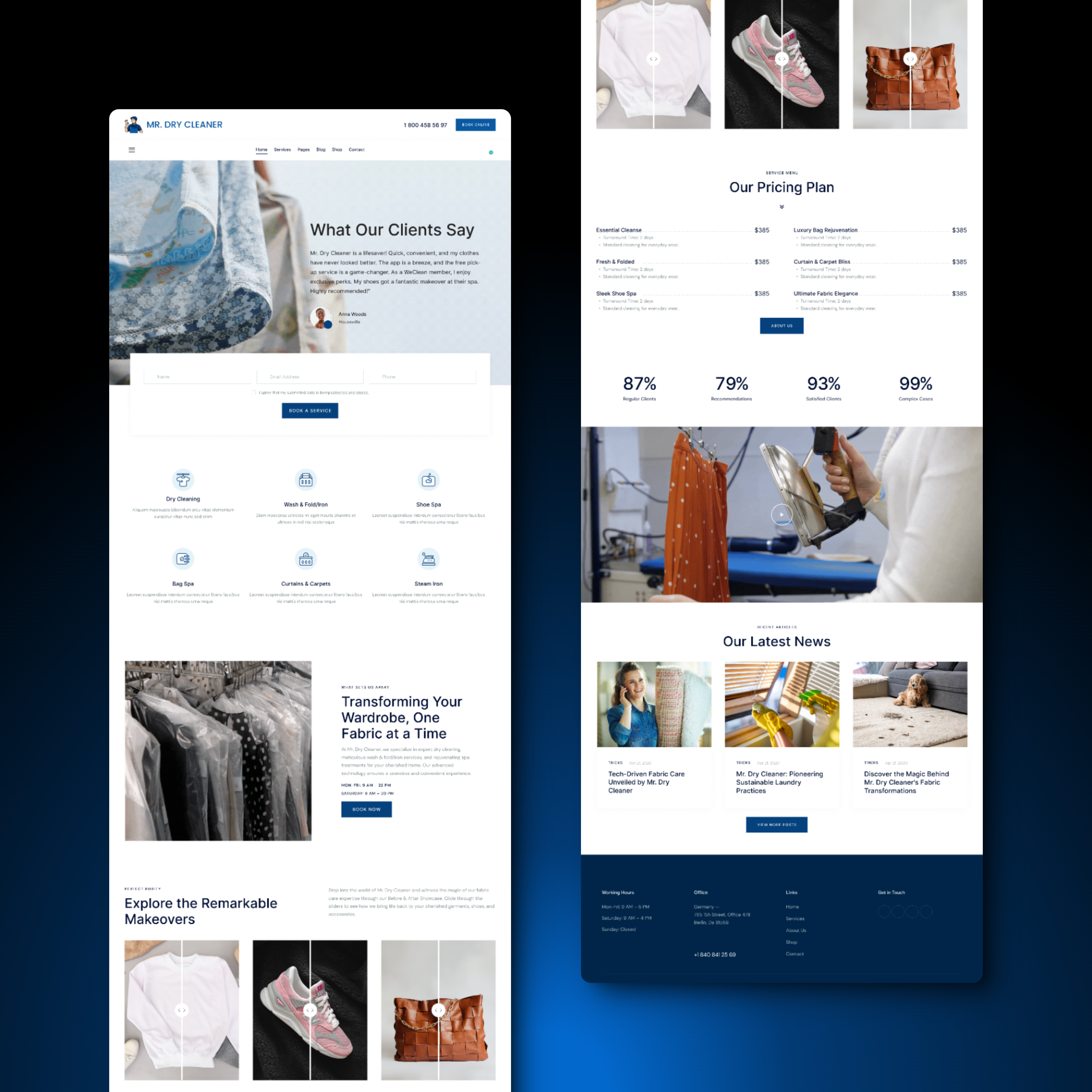
Mr. Dry Cleaner endeavors to offer an intuitive and seamless online platform for users seeking fabric care solutions. This UX case study focuses on the design of the services page, ensuring alignment with brand guidelines and enhancing user experience through clarity and proper user flow.
Objective
The primary objective is to craft a visually appealing and user-friendly services page that adheres to newly established brand guidelines, facilitates easy understanding, and guides users through a logical flow of information.
Research
- Conducted market research to understand industry trends and user expectations in fabric care service websites.
- Analyzed competitor websites to identify common patterns and opportunities for differentiation.
- Collaborated with stakeholders to establish brand values, visual identity, and design preferences.
Design Process
- Brand Guidelines: Developed brand guidelines including color palette, typography, and visual elements to maintain consistency across all design elements.
- Logo Design: Designed a modern and memorable logo that reflects the brand’s commitment to quality and professionalism in fabric care.

- Information Architecture: Organized services into clear categories following a logical hierarchy to facilitate easy navigation and comprehension.
- Visual Design: Incorporated brand colors, typography, and imagery to create a visually cohesive and engaging layout.
- User Flow: Ensured a smooth user flow by strategically placing call-to-action buttons and guiding users through the services offered.
Results
- The redesigned services page adheres to brand guidelines, reinforcing brand identity and consistency.
- Users find the website page easy to understand, with intuitive navigation and clear communication of services.
- Proper user flow ensures users can easily find relevant information and take desired actions, leading to improved user satisfaction and engagement.
Conclusion
The redesign of the Mr. Dry Cleaner services page demonstrates a successful application of UX principles and adherence to brand guidelines.
By prioritizing clarity, consistency, and user flow, the new design enhances the overall user experience, aligning with the brand’s values and goals.


