


Project Overview
As the UX designer for Zizry, I was tasked with rebranding the app’s visual identity and addressing key usability challenges. This project involved rebranding the colors, simplifying the category hierarchy, and redesigning the navigation to enhance the overall user experience.
Problem Statement
Zizry’s user interface featured a complex and lengthy category hierarchy, making it difficult for users to quickly locate what they needed. Additionally, the navigation was unintuitive, leading to a frustrating user experience. My goal was to create a more accessible and user-friendly design that improved both functionality and aesthetics.
Objectives
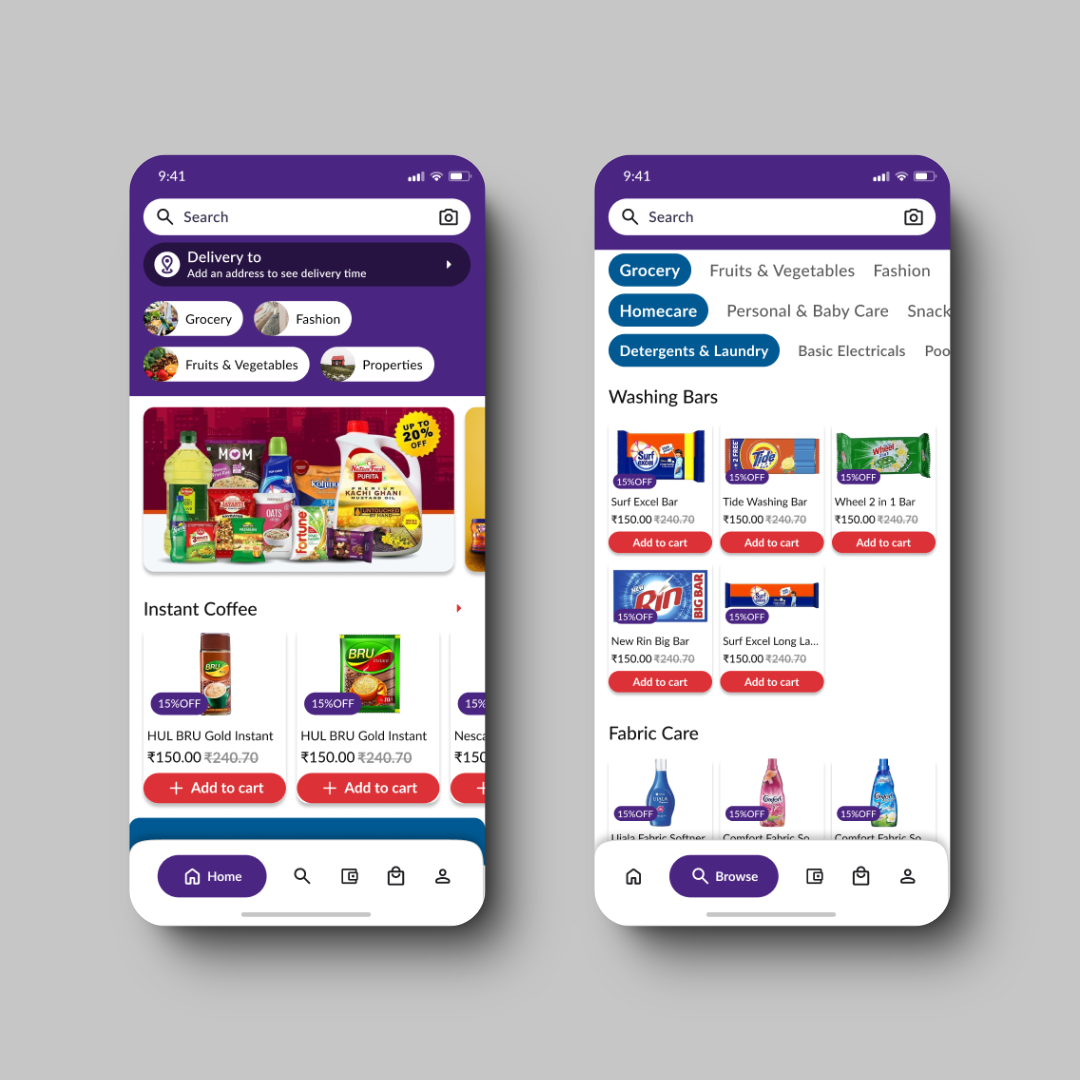
- Rebrand the color scheme to better align with Zizry’s modern and vibrant identity.
- Simplify the category hierarchy for quicker and easier product accessibility.
- Redesign the navigation to create a more intuitive and seamless user experience.
Process & Approach
User Research & Analysis
- Conducted user interviews and surveys to identify pain points.
- Analyzed the existing app’s navigation flow and category structure.
- Performed competitor analysis to benchmark industry standards.
Color Rebranding
- Selected a vibrant and modern color palette to reflect Zizry’s brand values.
- Applied the new colors consistently across the app to enhance visual clarity and engagement.
Category Hierarchy Simplification
- Restructured the category system, elevating frequently accessed categories to the top level.
- Grouped similar items together to reduce the complexity of navigation.
Navigation Redesign
- Introduced a bottom navigation bar for easy access to key sections: Home, Search, Categories, and Account.
- Streamlined the navigation flow, making it more intuitive and reducing user effort.
Prototyping & Usability Testing
- Developed wireframes and high-fidelity prototypes using Figma.
- Conducted usability testing to gather feedback and iterate on designs.
- Refined the design based on user feedback to ensure it met user needs.
Challenges
- Ensuring the new color palette was both aesthetically pleasing and met accessibility standards.
- Balancing simplicity with comprehensive functionality in the category structure.
- Designing a navigation system that was intuitive for both new and existing users.
Outcomes & Impact
- Enhanced User Experience: The redesigned app offered a more intuitive and engaging user experience, leading to increased user satisfaction.
- Improved Accessibility: The simplified category structure and revamped navigation made it easier for users to quickly find what they needed.
- Positive User Feedback: Post-launch feedback indicated a significant improvement in the app’s usability and visual appeal.
Key Learnings
- User-Centric Design: Understanding users’ needs and pain points is essential to creating effective designs.
- Iterative Process: Continuous testing and iteration are key to refining the design and ensuring it meets user expectations.
- Consistency: Maintaining visual and functional consistency across the app enhances the overall user experience.
Conclusion
The Zizry app redesign was a comprehensive project that addressed both visual and functional challenges. By rebranding the colors, simplifying the category hierarchy, and improving navigation, I was able to create a more user-friendly and visually appealing app. This case study demonstrates the importance of thoughtful UX design in delivering a successful digital product.
